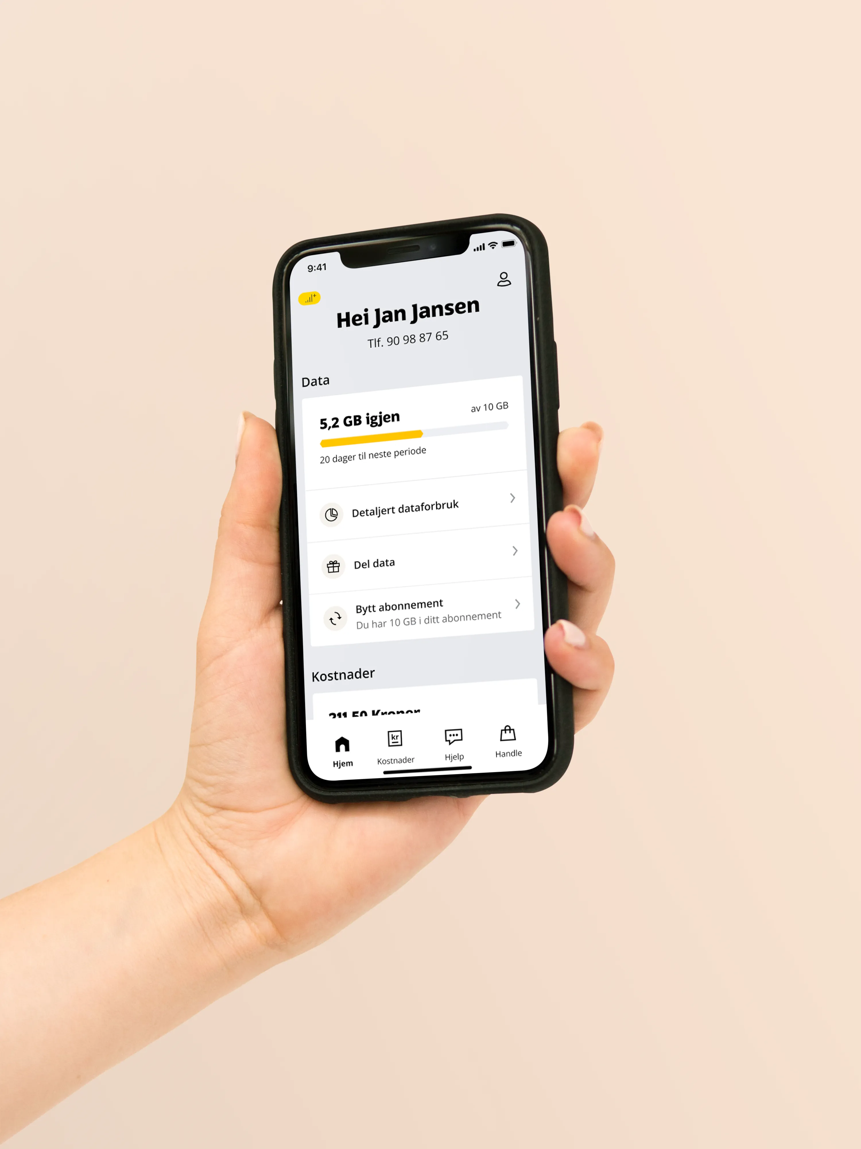
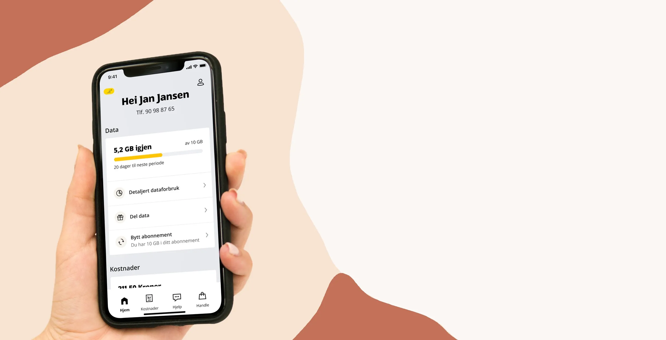
A hand holding a phone with the Ice app

ICE

A new information architecture

From technical possibilities to mental models

Role
Senior UX designer
Product type
Self-service
Team
App
Period
2023 – 2024
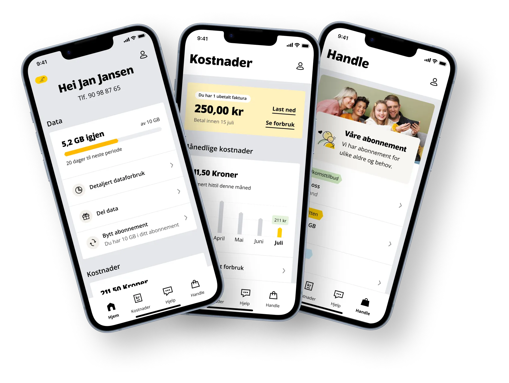
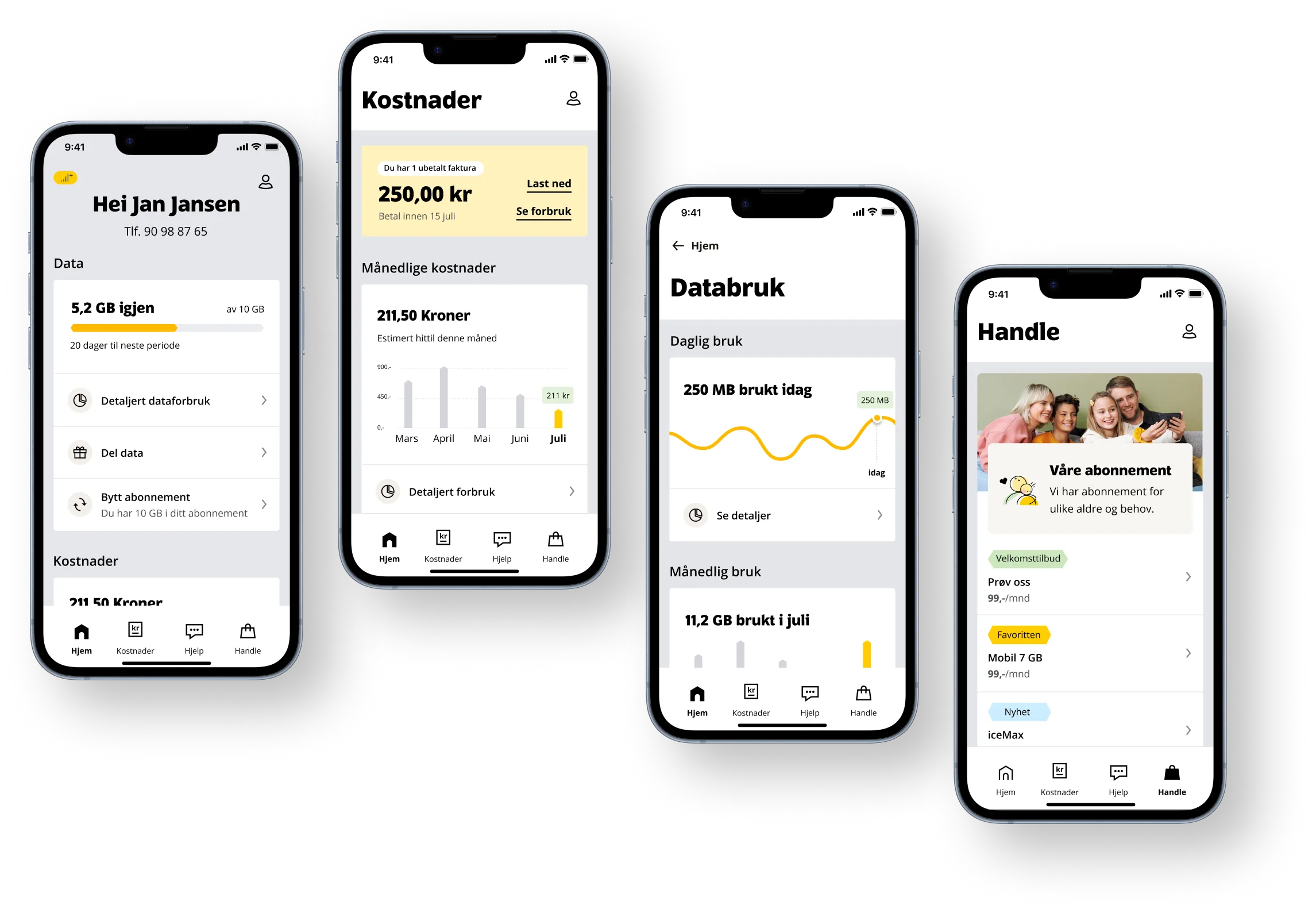
Four phones showing the new design of the Ice app
See the whole caseHide the whole caseInsight, card sorting, concepts, final design and components

Background

About Ice

Ice is a Norwegian mobile operator launched in 2009. It offers a nationwide mobile network with 4G and 5G, flexible subscriptions and user-friendly self-service. Ice is known for competitive prices and easy access to customer service.

A hand holding a phone with the Ice app

Role

My tasks

At Ice I worked on developing the app and Min side further. I sketched new solutions, tested them with users and worked on the design system and components in Figma. I also took part in weekly prioritisation meetings, where I contributed user insight and design expertise.

My biggest project was improving the information architecture of the app. Here I show how I approached it, and the solution we arrived at.

A hand sketching screens with a pencil

New information architecture

Project goals

  • Group and name things based on users’ mental models

    Navigation should be as intuitive as possible, with names and structure that match users’ own terms. This makes it easier to find things, keep track of where you are and navigate back.

  • An updated understanding of users’ key tasks

    Throughout the project I focused on identifying the most important user tasks, based on insights from user tests, analysis of user data and a thorough review of analytics.

  • Prioritise features based on user needs

    An important goal was to highlight features that solve problems for as many users as possible, while moving less central features into the background. This means prioritising what matters most to the majority, rather than trying to solve every smaller problem that only affects a few.

  • One information architecture for the app and Min side

    As far as possible, we aim to keep the structure of the app and Min side the same. This reduces design and maintenance work and gives a more consistent experience, unless there are clear reasons for different solutions.

Process

Design process

  • Identifying problems

    A pre-study with user testing, a sitemap and listening in on customer service calls.

  • In-depth research

    Card sorting interviews, competitor analysis and gathering analytics data.

  • Exploration and ideation

    Several concepts and ideas were developed after each research method.

  • Prototyping and user testing

    Finally, two prototypes were tested against each other: one quite similar to the old design, and one with the new design.

  • Choosing a design

    The user tests clearly showed which way we should go.

Sketches and sticky notes on a whiteboard

Insight

Key findings

  • The five most important tasks

    Across all the methods, we found that paying the invoice, checking data usage, seeing detailed costs, changing subscription and sharing data are the most important tasks.

  • Unclear differences and overlapping content

    A lot of content overlaps, and users don’t quite understand the difference between it – for example invoice, usage and costs, or the subscription user versus the app user and the information that belongs to each.

  • Technical and perceived belonging don’t always match

    Even if things belong together technically, that isn’t necessarily how users see them. We had always grouped the subscription with what it technically belongs to (number, SIM card, restrictions), but users grouped the subscription with what you get with it – call minutes, data and so on.

Solution

New design

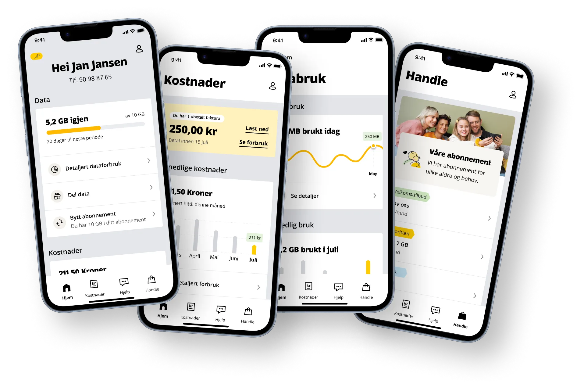
The new information architecture consists of four tabs: Home, Costs, Help and Shop. Profile, which used to be in the tab bar, has moved to the top-right corner. Below, I go into detail on each tab and why the design is the way it is.

Phones showing the tabs in the new design

Home

Data

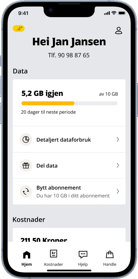
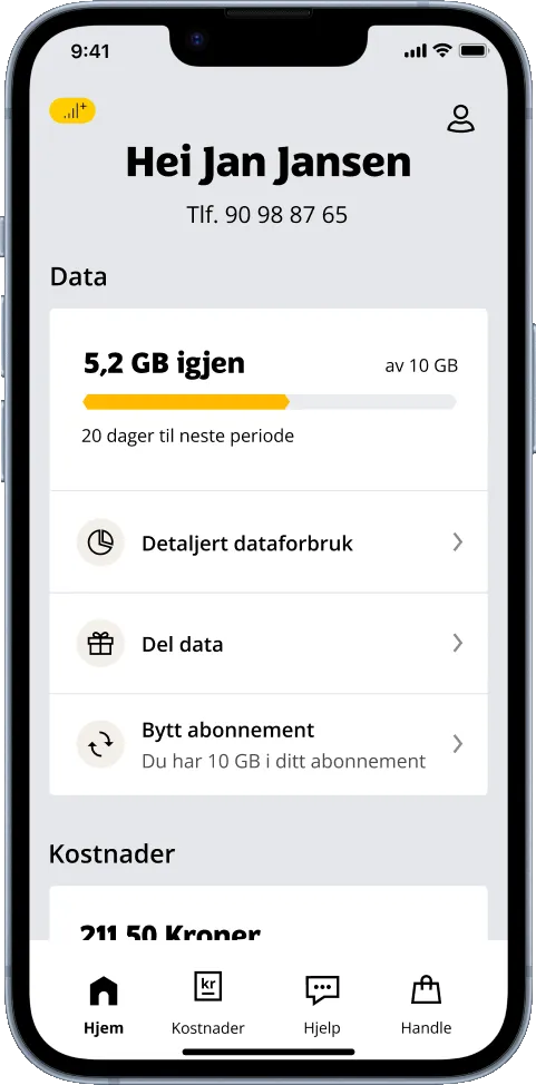
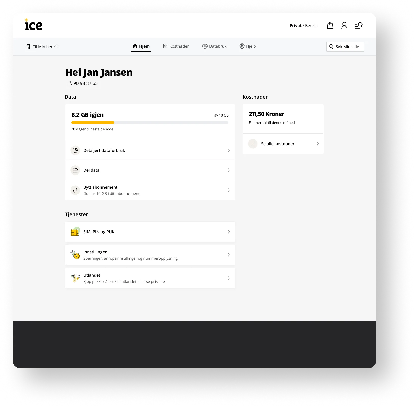
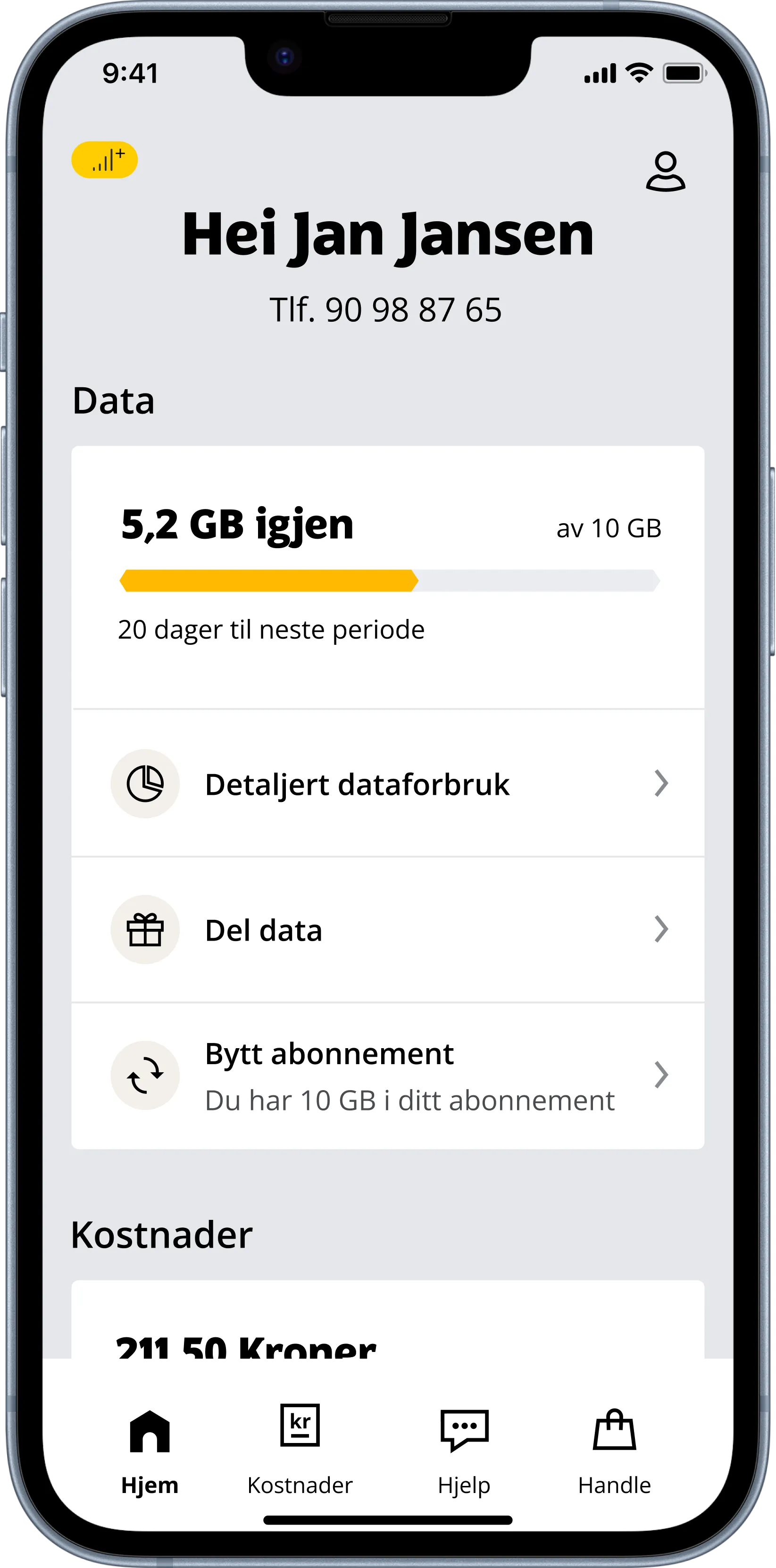
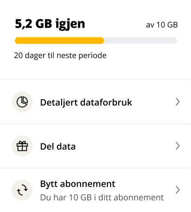
Home is split into three main parts: Data, Costs and Services. The most important task for users is checking how much data they have left, so that is shown at the top of the screen. Detailed data usage is also important and related to the remaining data.

Share data sits high up, as analytics showed it is the most used feature in the app – a very important task for users.

Change subscription is here because insight showed that many users use it often. For them, changing subscription mainly means adjusting how much data they have each month.

The home screen with remaining data at the top

Home

Costs and Services

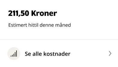
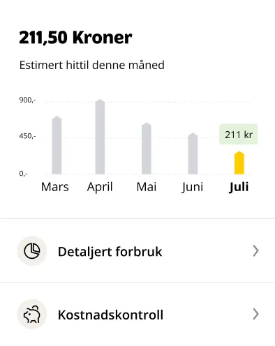
Knowing the costs so far this month is very important to users, and has therefore been given high priority.

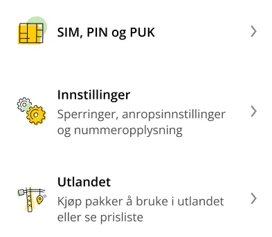
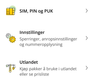
Technically, number, SIM card, restrictions and call settings are linked to the subscription, but that doesn’t reflect how users see it. They have been placed under Services, but can also be found under Profile, since users feel they belong there too.

Customer service calls showed us that information about travelling abroad is important to our users. So abroad was given special prominence in the new design.
The home screen in the app
Card showing costs so far this monthServices: SIM, PIN and PUK, settings and abroad

Home

Unpaid invoice

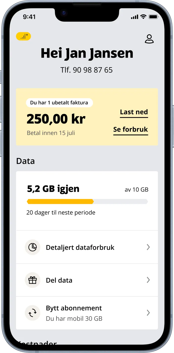
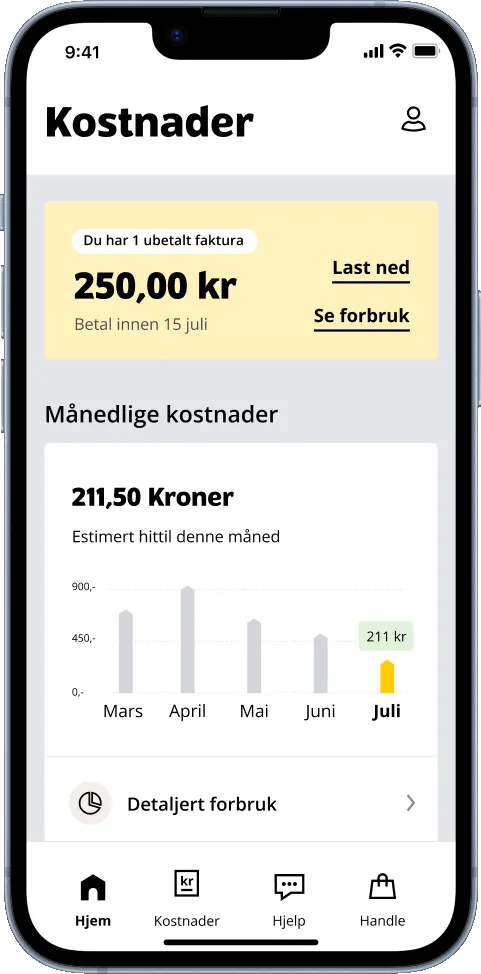
Seeing and paying the invoice is the most important task, but it’s only relevant once a month.

To make it easy to reach, the invoice is shown at the top of the home screen and the costs page when it’s unpaid. After payment it moves to the invoice archive, as other features like data usage and costs become more important.

We also chose to put “See usage” directly on the invoice. Many people call customer service to understand a higher invoice, and even though usage can be seen on Min side, most people don’t use it. We believe this change can significantly reduce the number of calls to customer service.

The home screen with an unpaid invoice at the top
Home on Min side in the browser

Tab

Data usage

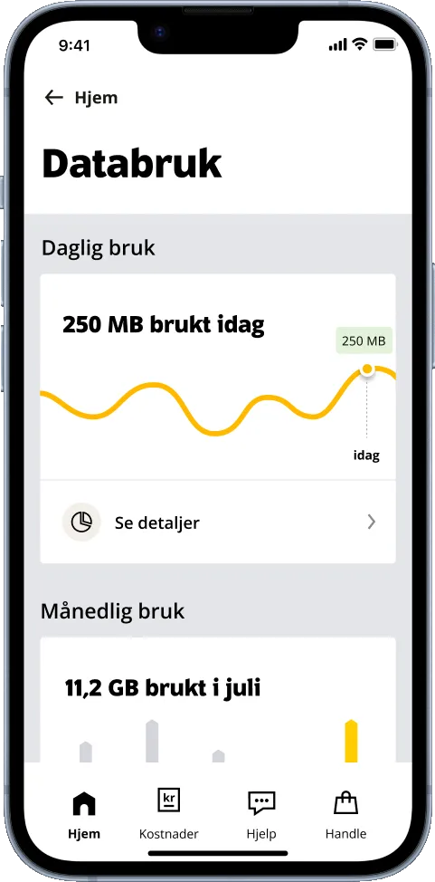
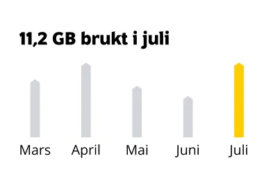
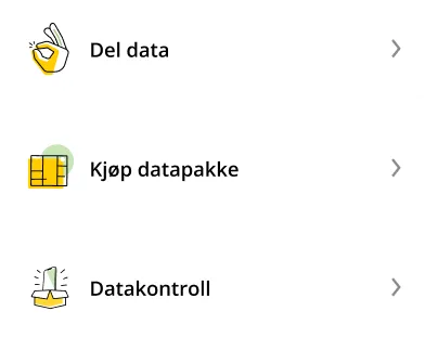
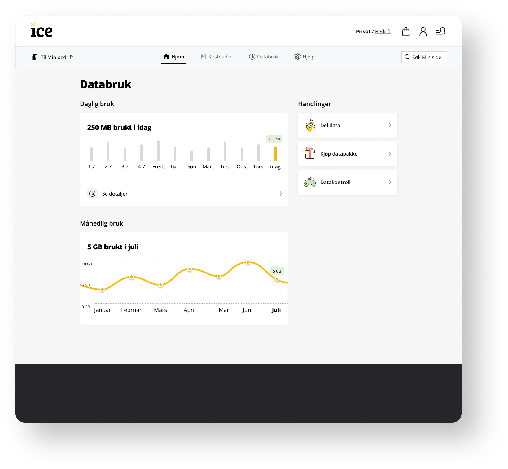
Here users get an overview of data usage per day and per month, plus features like share data, buy data and data control. Share data is one of the most used features, so it’s good to have it here too, even though it’s also on the home screen.

Buying a data package used to be important to show on Min side, but insight showed that users now change subscription rather than buy extra data. Data control, which used to belong to the subscription, is now placed here and lets users set limits on data usage per day or week.

The data usage page in the app, with daily and monthly usage
Card showing monthly data usageActions: share data, buy a data package and data control
Data usage on Min side in the browser

Tab

Costs

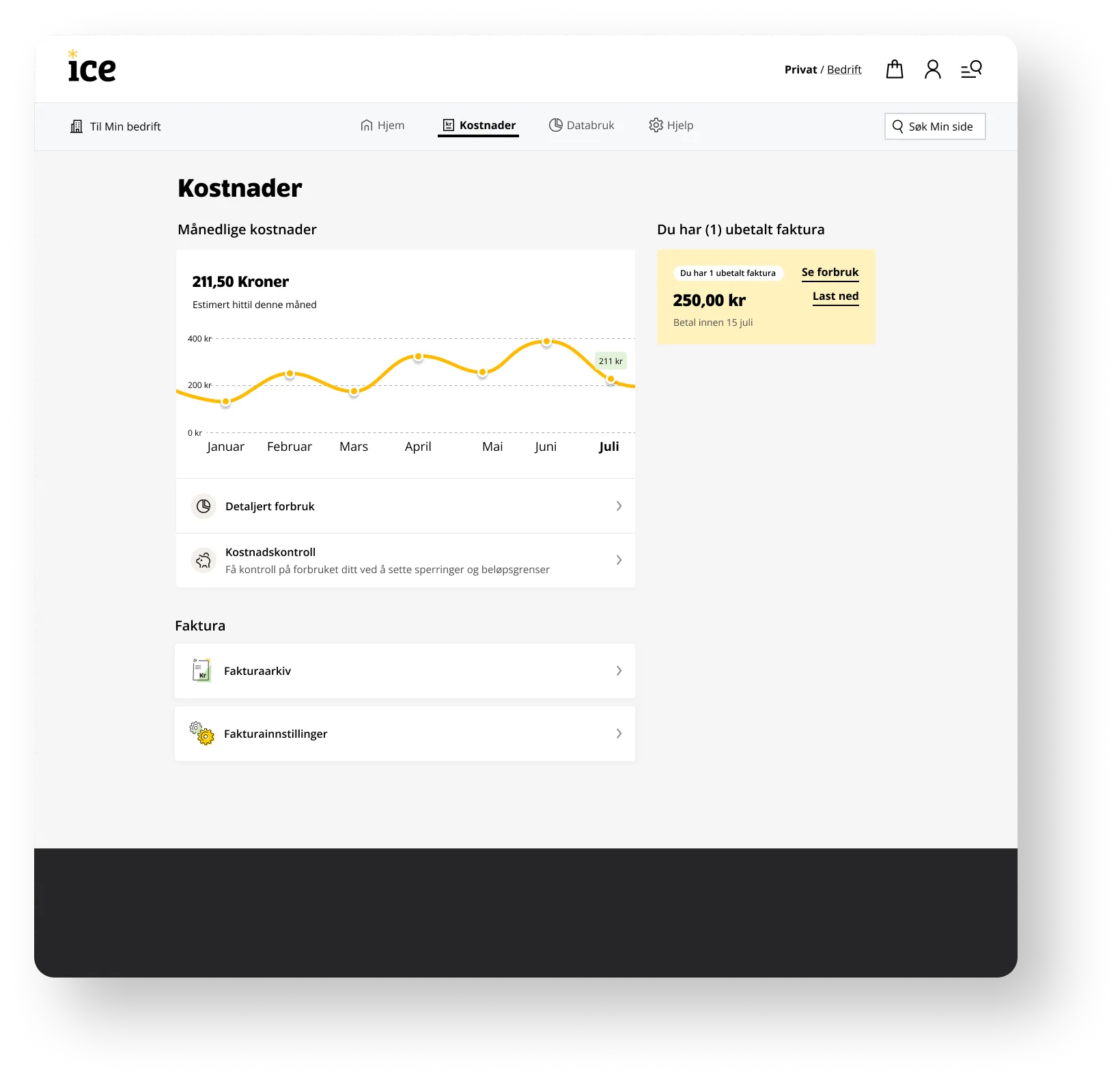
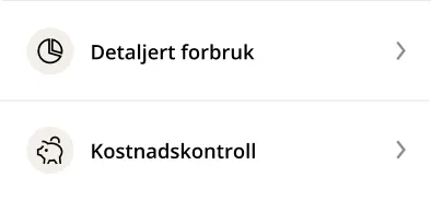
All usage is gathered here in one place. User tests showed that usage (apart from data) is most relevant when it costs money, so it made sense to collect it here.

We changed the name from “Invoice” to “Costs” so the page could hold more. Tests showed that users intuitively understood that the invoice is found here.

In the new design we also moved cost control from “Subscription” to “Costs”, as this is where users expect to find it.

The costs page in the app
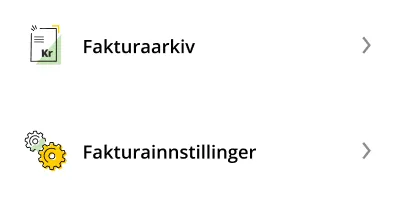
Monthly costs: detailed usage and cost controlInvoice: invoice archive and invoice settings
Costs on Min side in the browser

Tab

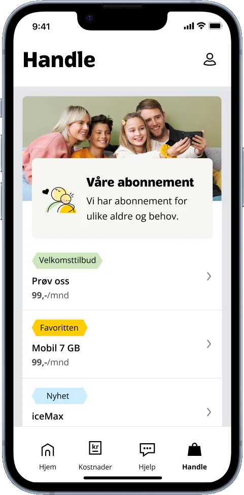
Shop

Insight showed us that everything you can buy should be gathered here, whether it’s a new subscription or an extra SIM card. The page has also been freshened up to make it more attractive, as this has a positive effect on sales.

The shop page in the app
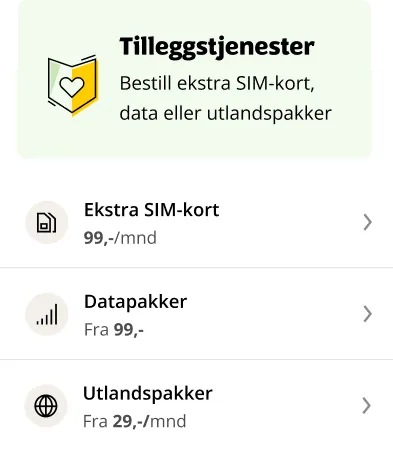
Add-ons: extra SIM card, data packages and travel packages

Profile

Content

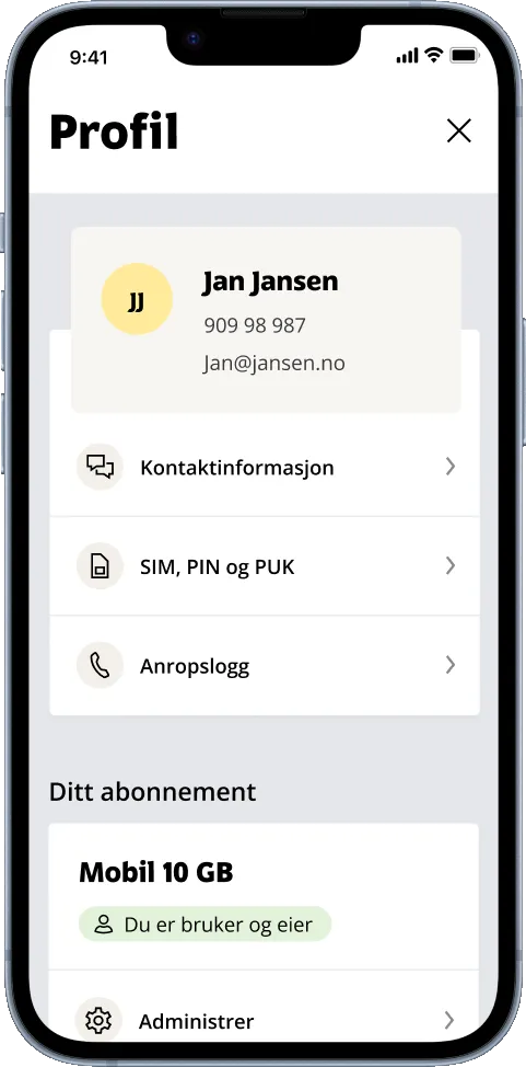
Card sorting revealed that people don’t quite understand the difference between the subscription user and the app user. The new profile page therefore merges the two. Users see SIM, PIN and PUK as something personal, tied to you as a person, so it’s natural to place them here too.

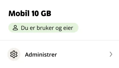
Manage subscription, which used to cover restrictions, directory listing and call settings, now only covers changing subscription – as this was what users wanted.

The new profile page in the app
Your subscription, with manageApp user: app settings

Profile

Placement

Profile should be somewhere you rarely go, yet analytics showed it was one of the most used tabs in the old design. After more research, we found that what most people did on the profile page was click back out again – meaning it was too easy to reach. So it has moved from the tab bar to the corner.

The home screen with profile in the top-right corner

Design system

Components

I’ll go through the two main components used in this design: two different types of cards. Other components were used too, but this project has mostly revolved around the card components.

Card 1

Composite

This card always sits at the top of the screen and highlights the most important information at the top of the card. Stronger colours at the top draw attention upwards. The cards that belong to it show clear information that’s easy to take in, often with an icon, but they are designed to be more neutral so they don’t compete with the top for attention at first glance. That’s why the icons have a beige frame, for a more subdued look.

Composite card for data, with remaining data at the topComposite card for costs, with a chart at the top

Card 2

Standalone

This card is usually used further down the screen and holds information that isn’t directly related to the rest of the content. An illustration makes it more visually interesting and engaging. Helper text can also be added when needed.

Standalone cards with illustrations: SIM, PIN and PUK, settings and abroad
Overview of the new information architecture on four screens

Thanks for taking a look!

The new information architecture makes it easier for customers to find what they need – whether that’s checking their data, understanding their costs or paying the invoice – with one shared structure for the Ice app and Min Side.